Mark your own learning status. Opening a course link does not establish enrollment.
About this course
Create Insightful Visualizations
Power BI has extraordinary visuals that can be used in reports and dashboards.
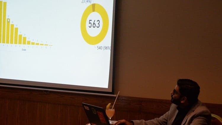
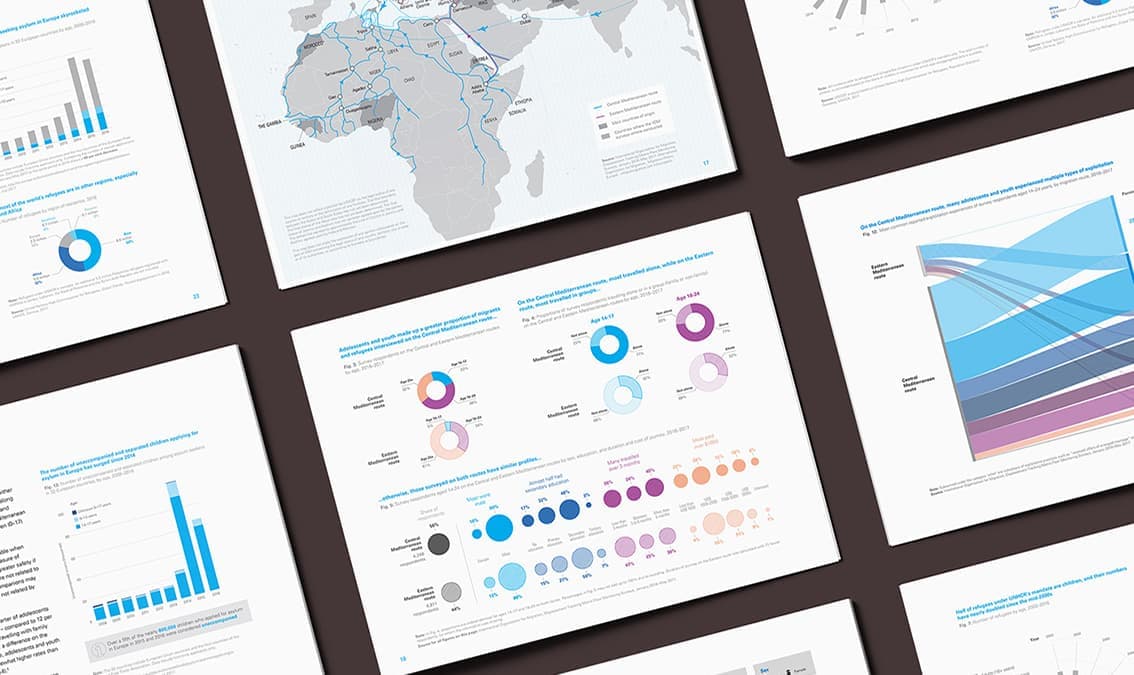
In this Power BI course, you’ll learn to create insightful visualizations through built-in and customized charts and conditional formatting.
Discover New Chart Options
You’ll discover how to create a plethora of visualizations such as scatter plots, tornado charts, gauges, and how to visualize everything without overwhelming your audience.