Udemy
Microsoft Excel: Data Visualization w/ Excel Charts & Graphs
Course4.6216kALL LEVELS
$199.99
 Udemy
UdemyMark your own learning status. Opening a course link does not establish enrollment.
A chart in Excel does more than decorate a worksheet — it makes patterns in the data visible that raw numbers hide. This course covers how to build charts in Excel across the full range of formats the tool supports, from simple bar and pie charts to more specialized options.
Excel users who already work with data and want their charts to communicate more clearly, without needing prior charting experience.
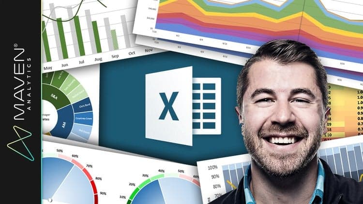
Learn to create awesome charts in Microsoft Excel. In Microsoft Excel, a chart is often called a graph. It is a visual representation of data from a worksheet that can bring more understanding to the data than just looking at the numbers. A chart is a powerful tool that allows you to visually display data in a variety of different chart formats such as Bar, Column, Pie, Line, Area, Doughnut, Scatter, Surface, or Radar charts. With Excel, it is easy to create a chart.
Advertisement
Microsoft Excel: Data Visualization w/ Excel Charts & Graphs

Excel Charts - Visualization Secrets for Impressive Charts